

Overview
Ventla is a mobile event planning platform used by Kanvas to facilitate and craft bespoke meetings, conferences, and delegation travel. This project is a redesign of their existing app to improve upon the current communication experience.
Solution
General Thread and Group Chat tasks flows were incorporated with an Impressive 90% positive feedback rate from both users and event administrators during benchmark testing.
Project Duration: 2 Week Sprint Tools: Adobe Photoshop | Figma | Miro My Role: Sole UI Designer | UX Researcher
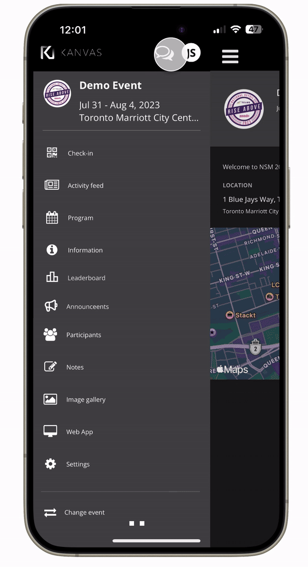
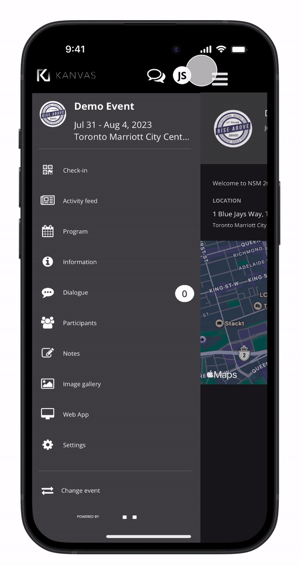
Current Experience
* Please note names and confidential information have been omiited to protect the privacy of the participants.
Kickoff
During our team meeting, convened to initiate our upcoming project, we delved into the user experience challenges encountered during our large-scale week-long events utilizing the Ventla app. It became apparent that attendees, particularly those traveling from different branches across Canada, faced significant hurdles with the app's networking functionality. The discussion highlighted a pressing need to enhance the app's capabilities to facilitate broader networking opportunities and address user dissatisfaction. As we kick-start this project, my focus was on integrating user research with business objectives within the constraints of an MVP framework, considering time limitations. I aimed to develop task flows and features to address the challenges identified by our clients in collaboration with the Ventla team. The goal was to enhance networking, encourage dynamic discussions, and prolong user engagement beyond the official event schedule to improve retention.
The Observed Problem
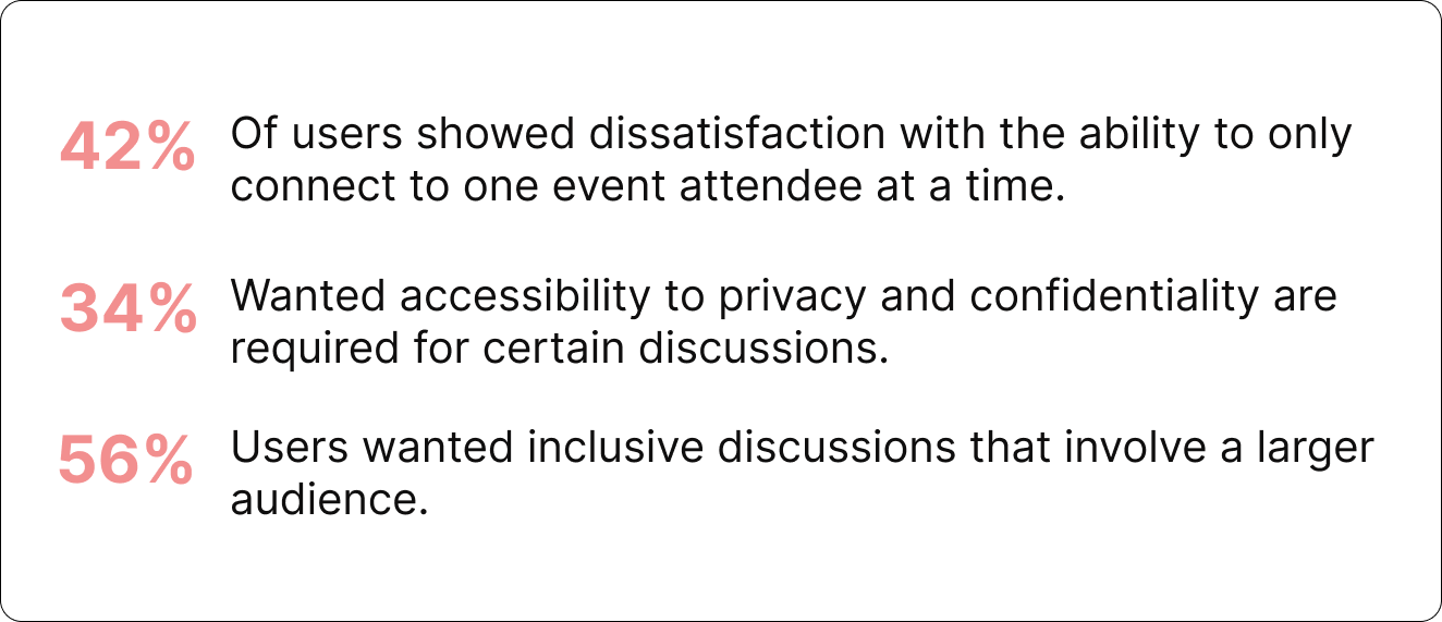
Attendees, including those from various branches across Canada, expressed challenges with the app's networking features, which limited interaction to only 1:1 individual participant communication. This restriction led to widespread frustration among users seeking broader networking opportunities, highlighting a clear gap in the app's functionality. To address this issue effectively, I focused my efforts on redesigning the communication experience flow to better meet user needs and expectations
Additionally administrators provided the following:
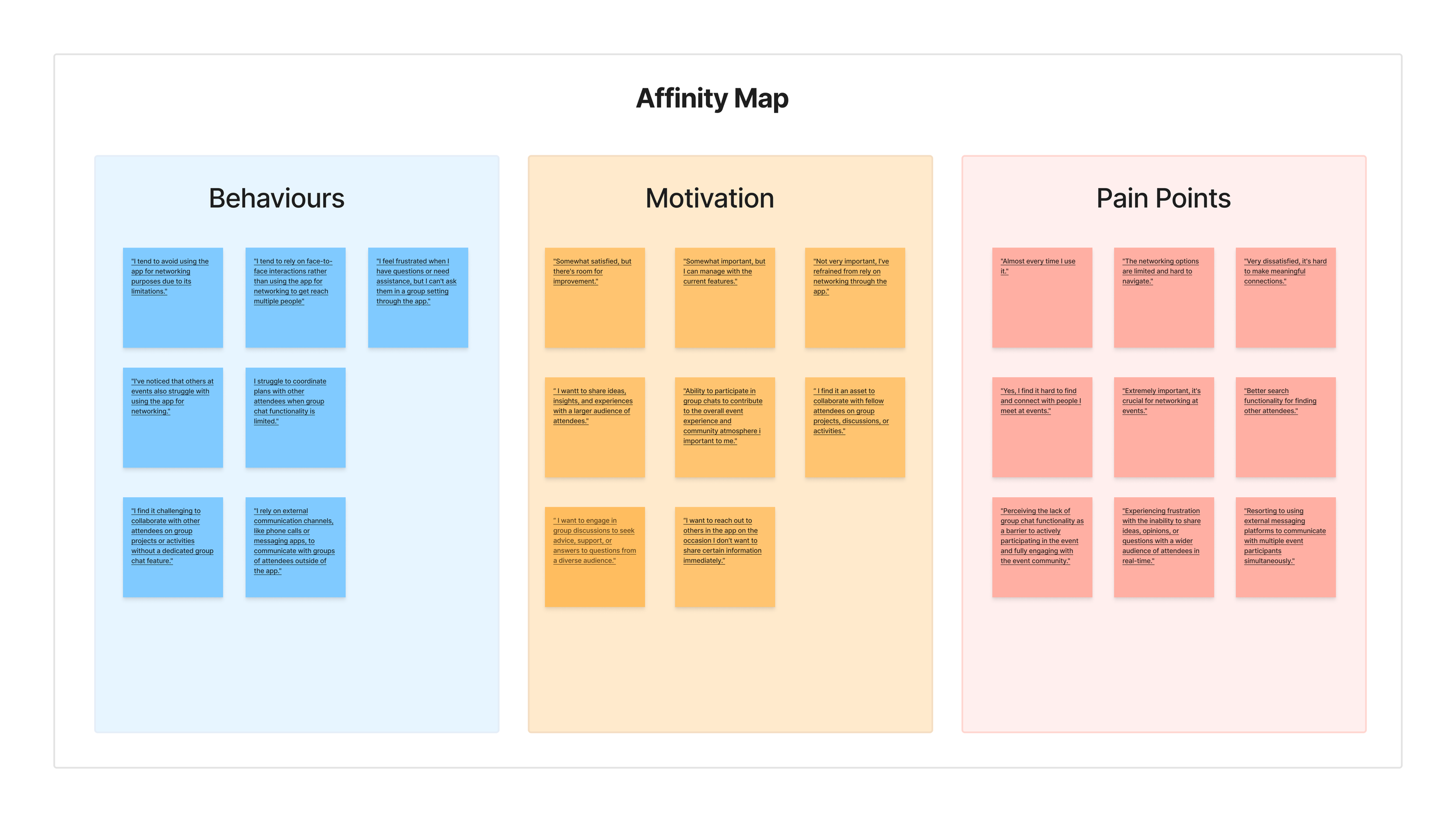
Analyzing the data we collected from our short and open ended surveys a recurring theme emerged. Users had a strong desire to share and communicate event knowledge with multiple individuals. Their inability to do so within the app led users to leave the platform for external communication.
Key Insight
User Research & Insights
Micro Interactions
Providing immediate feedback to users, confirming that an action has been successfully completed.
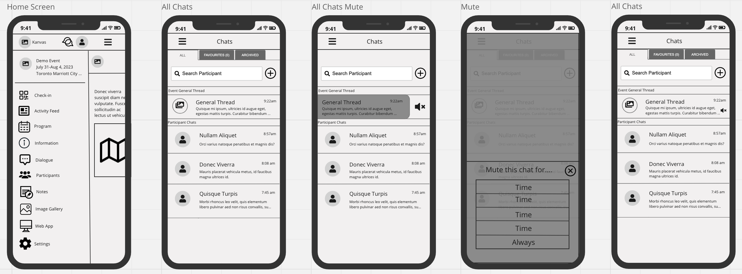
Wireframes were created with a focus on simplicity and intuitive navigation, these wireframes outline the key features and user interactions, ensuring a seamless journey for both event organizers and attendees. All the while adhering to the current design UI system.
Prototyping
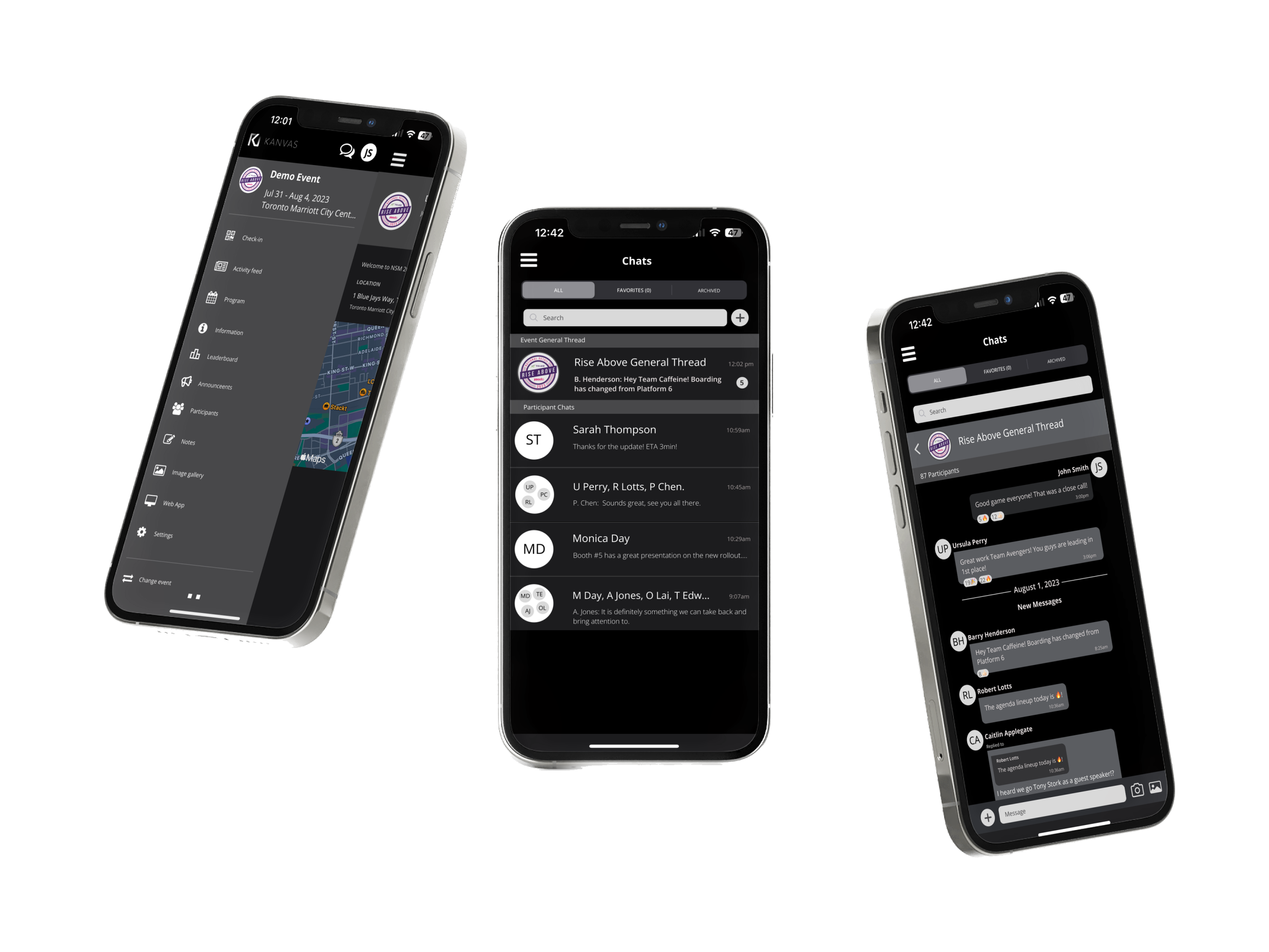
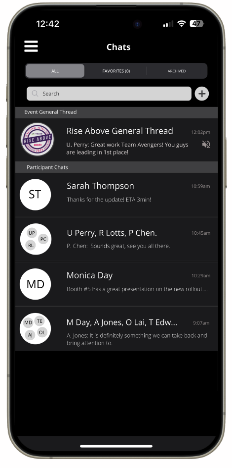
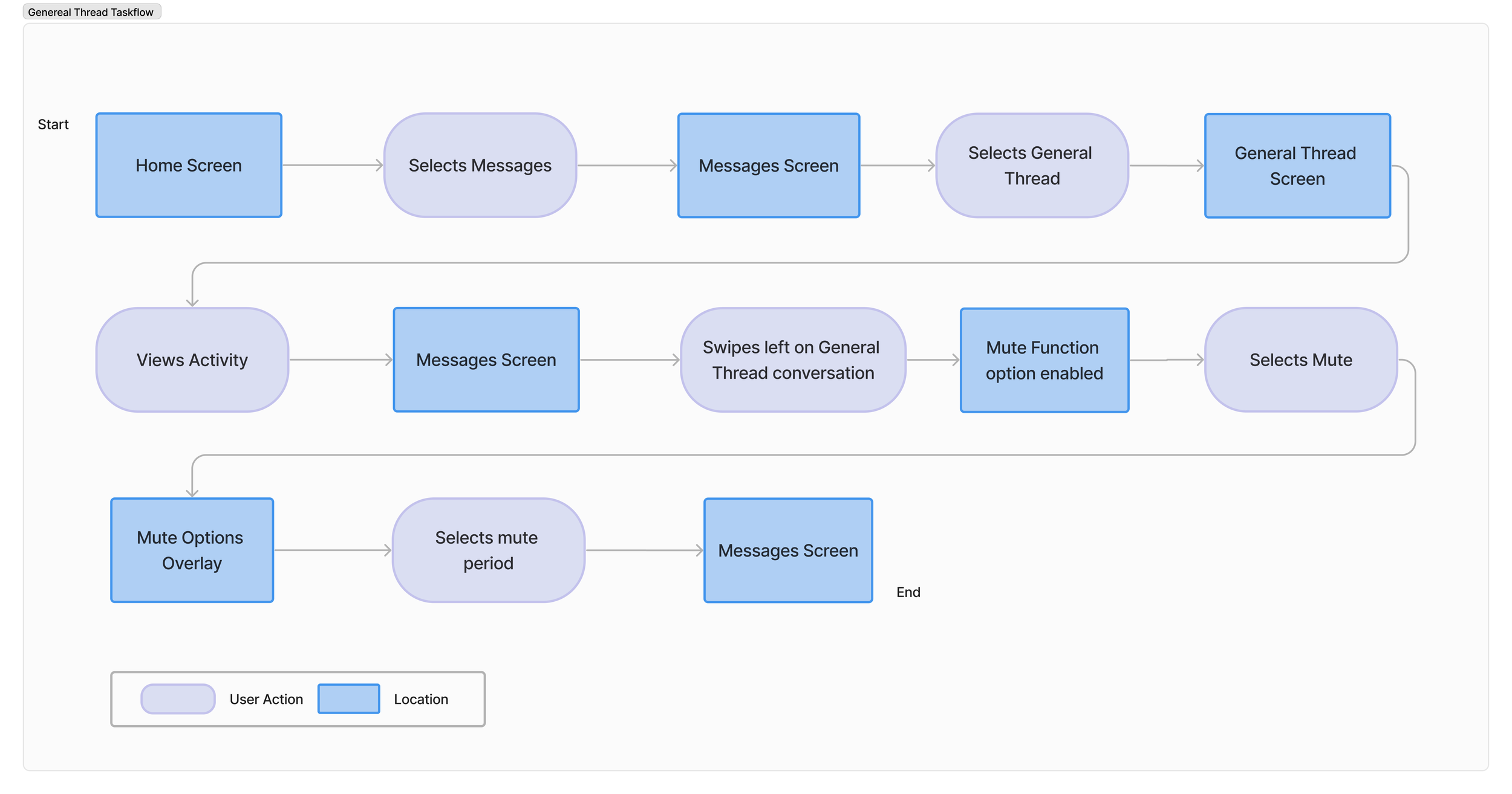
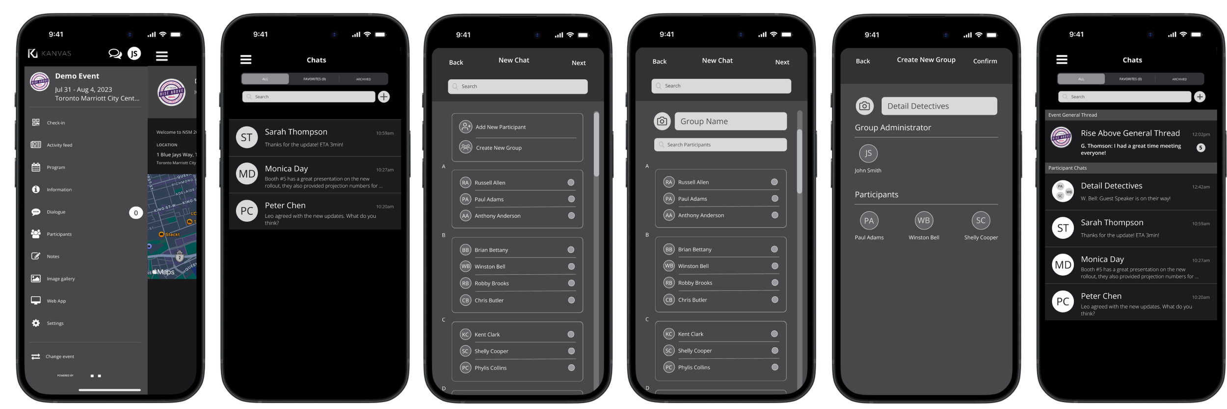
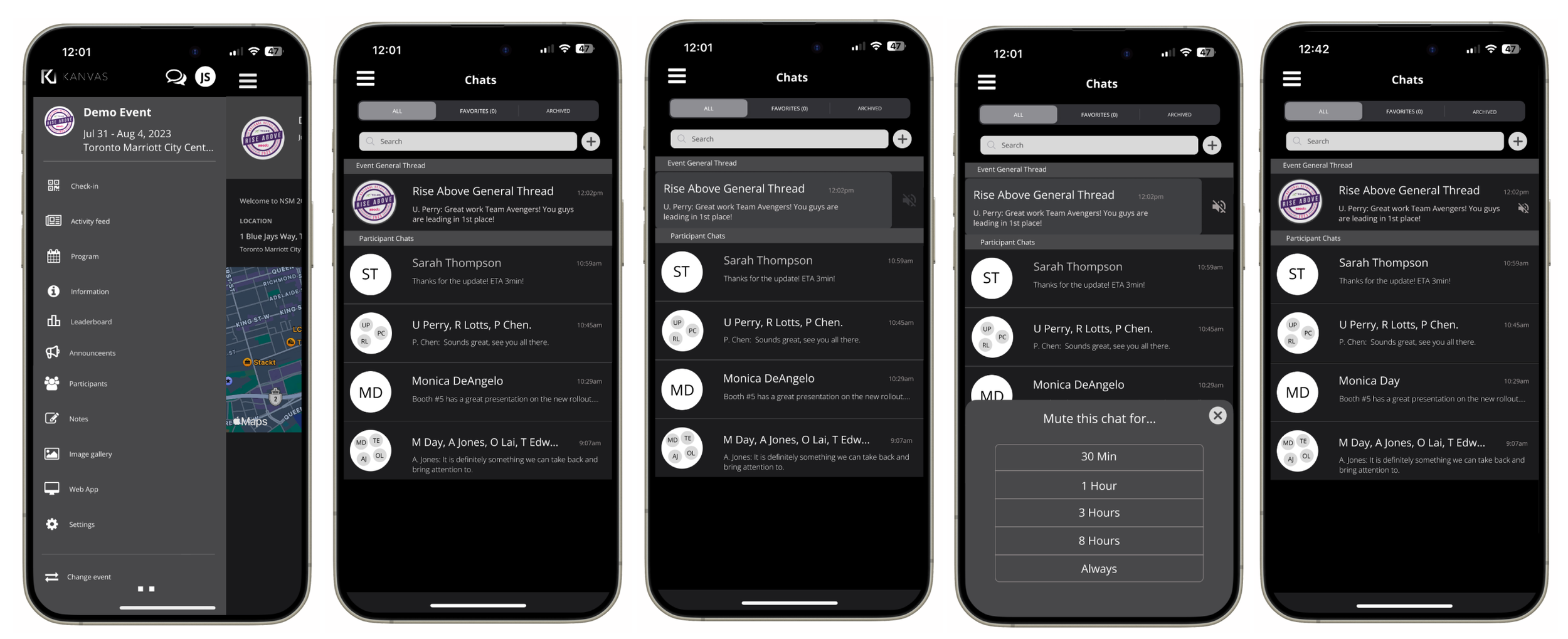
As the General Thread feature is a pre-set, continuous notifications may cause some inconvenience to users. However, with the mute function enabled, users can silence notifications as required while still enjoying uninterrupted interaction with their network. Without having to open the thread users will see the number of messages. Once the thread has been open, the number of messages notification will be disappear.
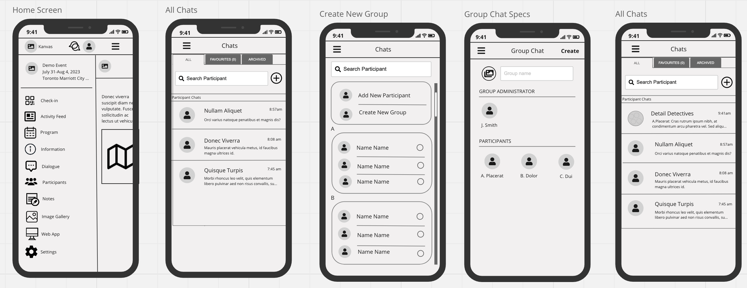
Additional capability within the Group Thread feature include to respond to messages succinctly, search for specific messages or keywords and support for emojis and stickers, and media sharing such as photos, videos, documents.
Group Chat Feature
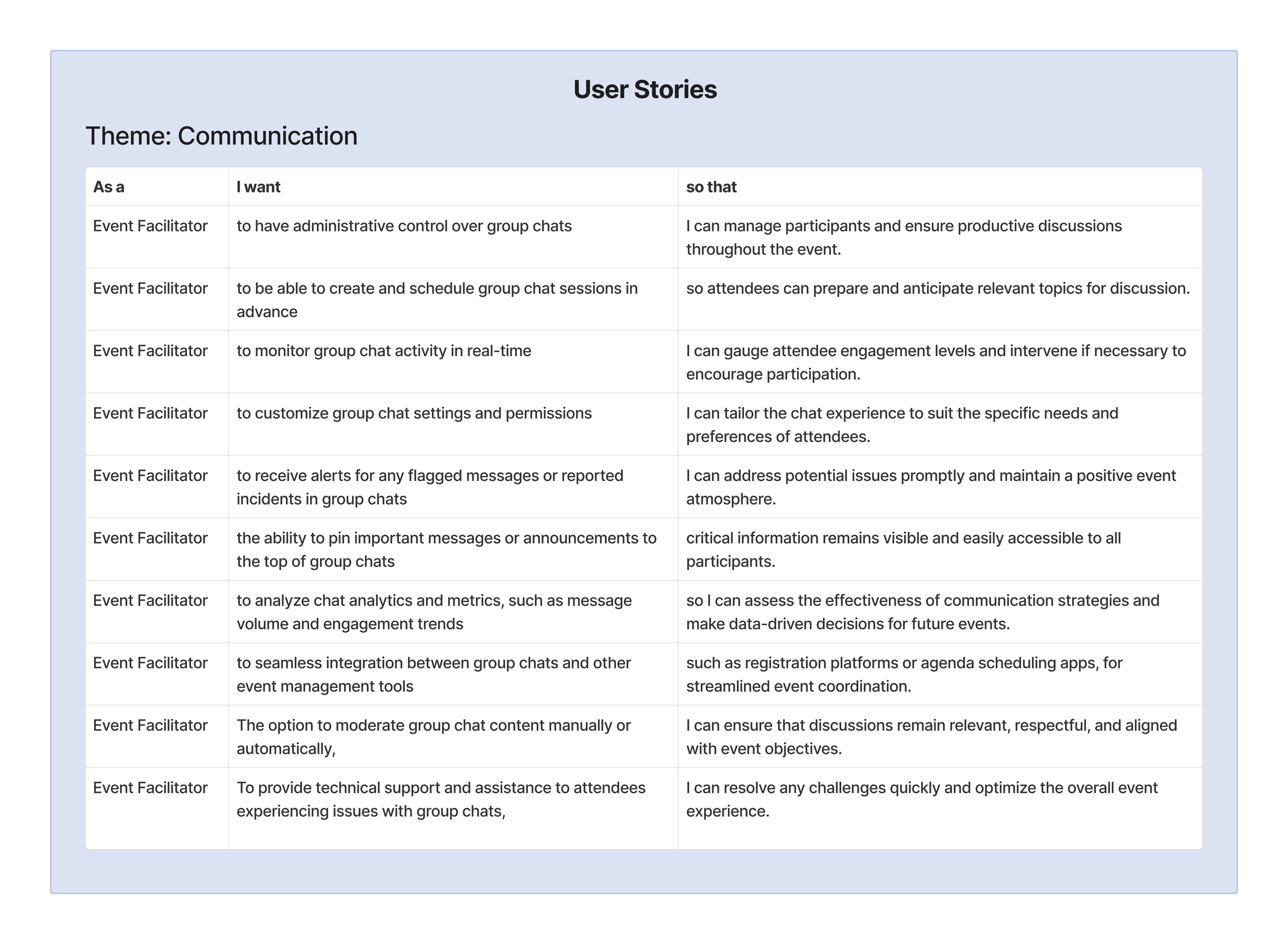
After my scope was identified, I went to work on ideating user stories from the perspective of the event attendee and event facilitator. These user stories served as a foundation for defining user flows, outlining the sequential steps and interactions users would take to accomplish their goals within the app. By focusing on user needs and priorities, my goasl was to create intuitive and user-centric design solutions that effectively addressed the challenges identified during the research phase.
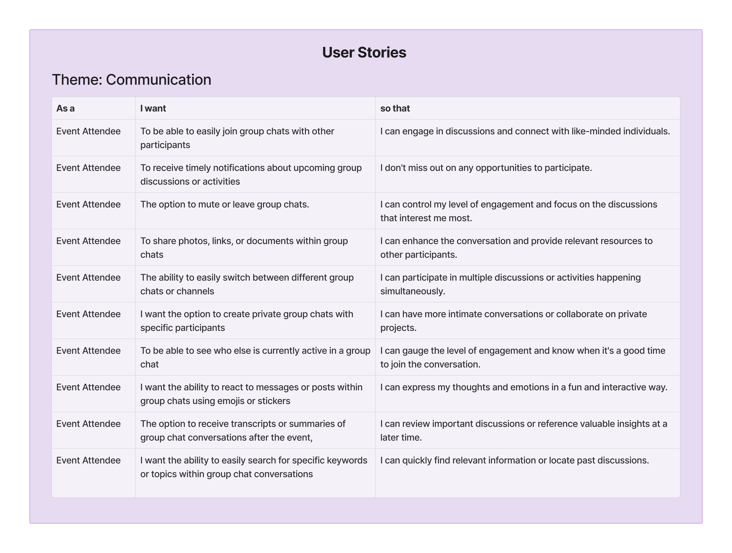
Surveys were sent out to obtain feedback from our event attendees to attain more insight. My goal was to gain both qualitative and quantitative data to further grasp our users pain points. Once the result were received the information was organized into an affinity map of which I sourced insights from.
With the user research we gathered I was then able to hone into my scope:
“…how might we retain users from leaving the platform?”
Accessibility
Ensure sufficient contrast between text and background colours for readability.
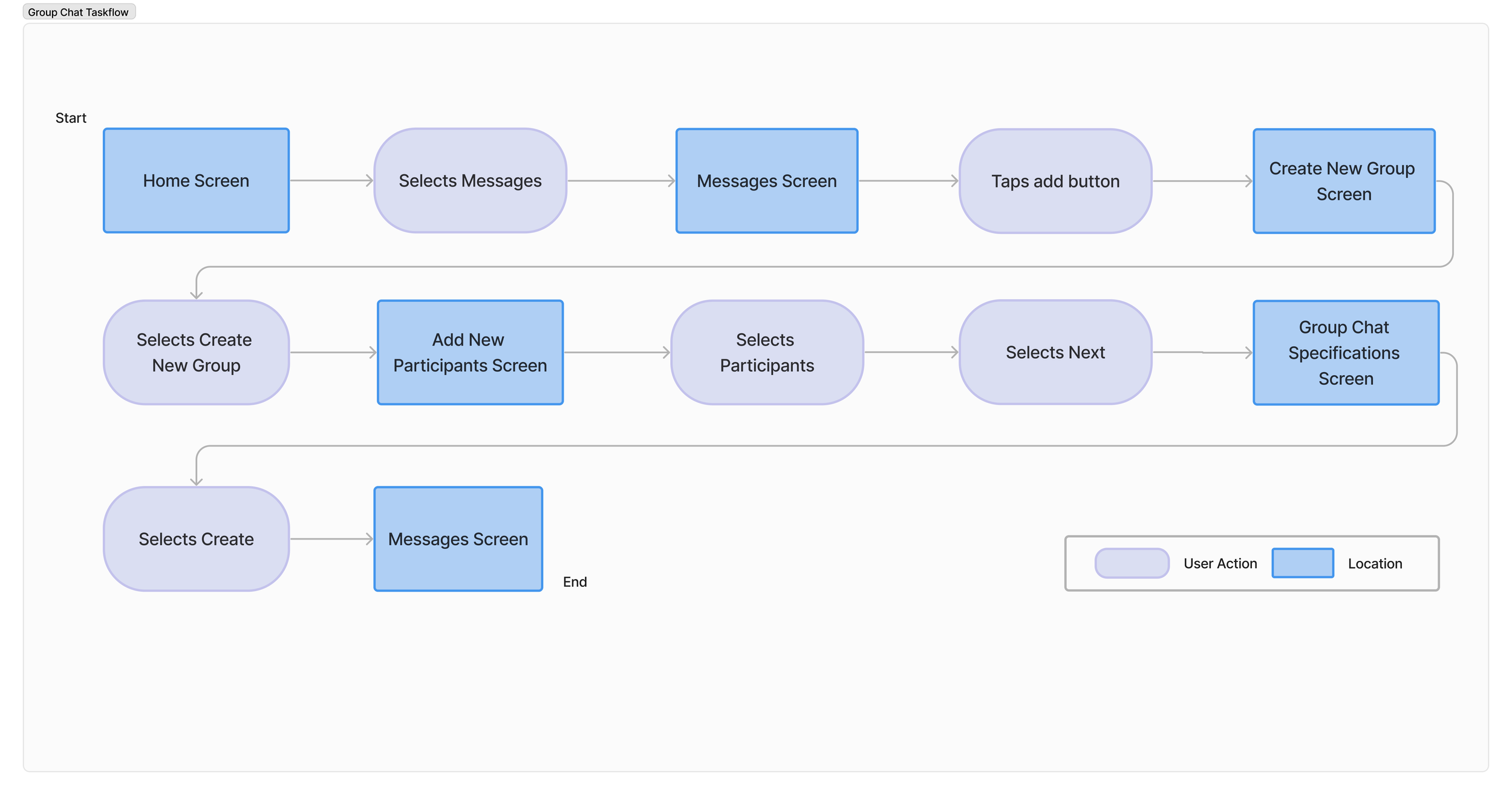
Given the constraint of a 2-week timeframe and the focus on creating a minimum viable product (MVP), I proposed two task flows to be developed, one for a general thread, and another for a group chat.
Information Hierarchy
Mindful of prioritizing content and arranging information based on importance and relevance, highlight conversation replies prominently.
General Thread
Group Chat Flow
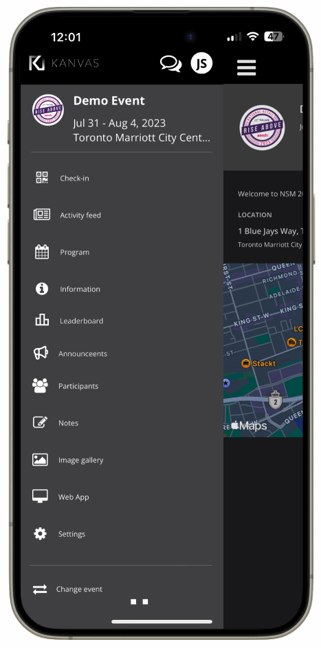
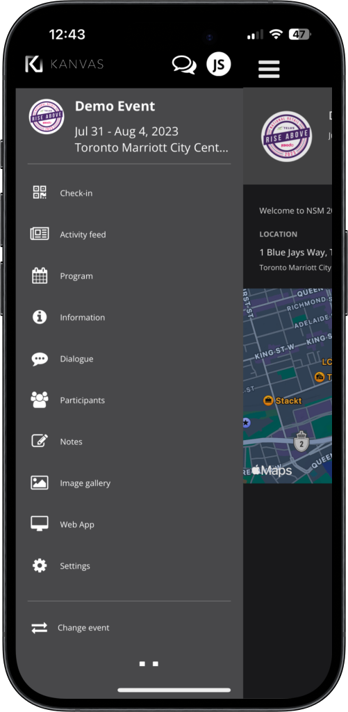
High Fidelity Screens
General Thread function
General Thread
Defining The Flow
Intuitive Navigation/ Consistent Formatting
Consistencies with the current design to ensure that users can easily navigate through the design without confusion.
High-fidelity screens underwent a thorough review process for their adherence to consistency ensuring visual harmony throughout the app.
Design Impact
Group Chat Flow
Usability testing with our prototype revealed an impressive 90% positive feedback rate from both users and event administrators. Users praised the intuitive and straightforward flow, with 85% expressing satisfaction with features like visual notification cues, which effectively reduced missed messages. Users also expressed their unlikely hood to leave the app to utilize alternative communication tools improving user retention.
Currently, we are awaiting feedback and working closely with the Ventla team to explore the integration of this feature for future use. As a product designer, recognizing the alignment of this flow with business goals is imperative for its successful integration into the app and ensuring its relevance.
After finalizing the task flow, I proceeded to create the wireframes. With an existing design system streamlined the wireframing process, allowing me to swiftly translate the task flows into visual representations. The wireframes were crafted with careful consideration for the established design principles and user interface guidelines such as the following:
Wireframing
The Challenge
With the goal of enhancing overall user experience and UI to boost user engagement, I was assigned the task of exploring options to redesign features within the app within a two-week timeframe. The objective was to garner attention from the Ventla team and implement these enhancements for our future use.
Solution Feature Proposal
As the primary product designer, within a tight 2-week timeframe and using an MVP framework, I utilized the insights from user research to develop both a Group Chat Function and a General Thread Function. These features were designed to improve networking capabilities, enabling users to connect with their network effectively, addressing the following issues:
1. Assist in fostering a sense of community among users.
2. Facilitate a space that enables participants to coordinate plans, share ideas, and discuss logistics efficiently.
3. Users need the ability to communicate quickly check in with their network, especially in their event teams.
Users have the ability to create personalized group chats tailored to members' interests and preferences, fostering intimate interactions and content sharing. These small group chats facilitate focused conversations, enhancing communication and collaboration for more effective decision-making overall .