Overview
Sector: Event Planning
Project Type: Academic
Project Duration: 10 Weeks
Tools: Adobe Photoshop | Figma | Canva | Google Notes
My Roles: Lead Designer | UX Research | UI Design
Project Summary
The objective of this case study is to address the loneliness experienced by individuals transitioning into retirement. It is a platform that focuses on facilitating social engagement, enables the discovery of new opportunities, and fosters connections with like-minded individuals within their communities.
Discovery
User Research
My User Research strategy involved two key components:
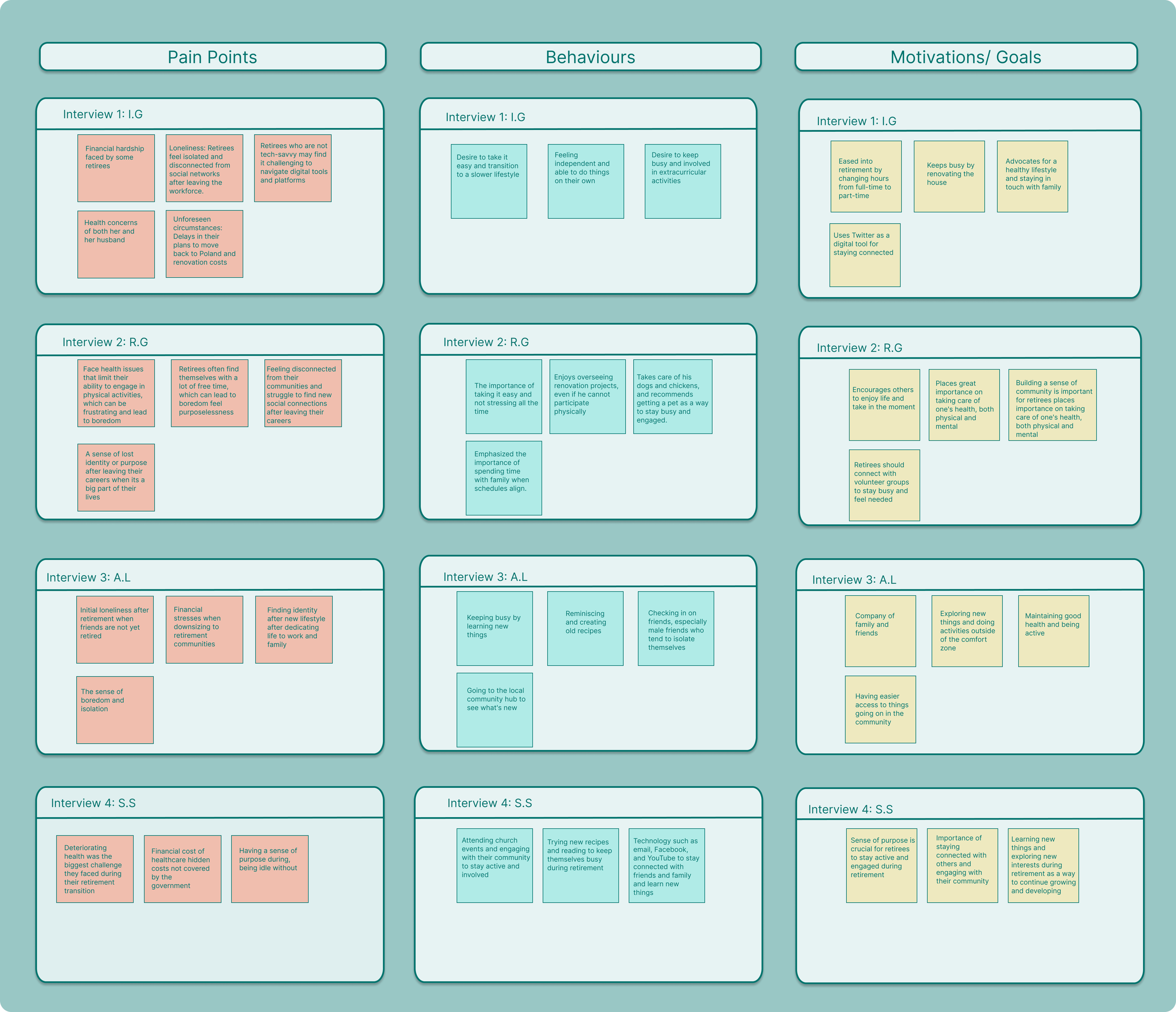
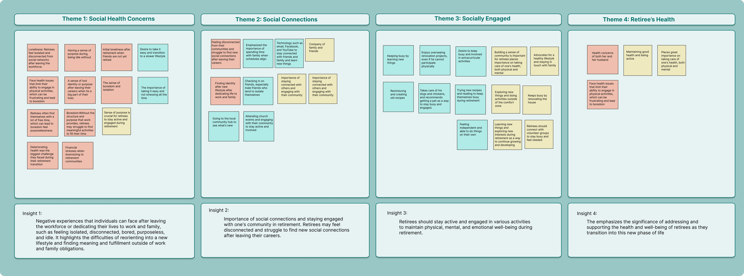
Through a thorough analysis of primary research data, I gained valuable insights into the pain points, behaviors, and motivations of the interviewed retirees. This process allowed me to deeply understand my interviewees and extract meaningful insights. Utilizing these qualitative insights, I translated the data into an affinity map, categorizing the pain points, behaviours, and motivations of retirees.
Accessibility:
To ensure the interface is easy to navigate and understand, with clear fonts and adequate contrast for readability.
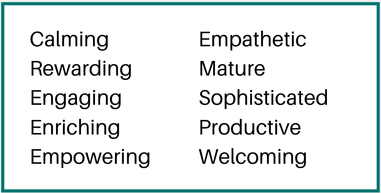
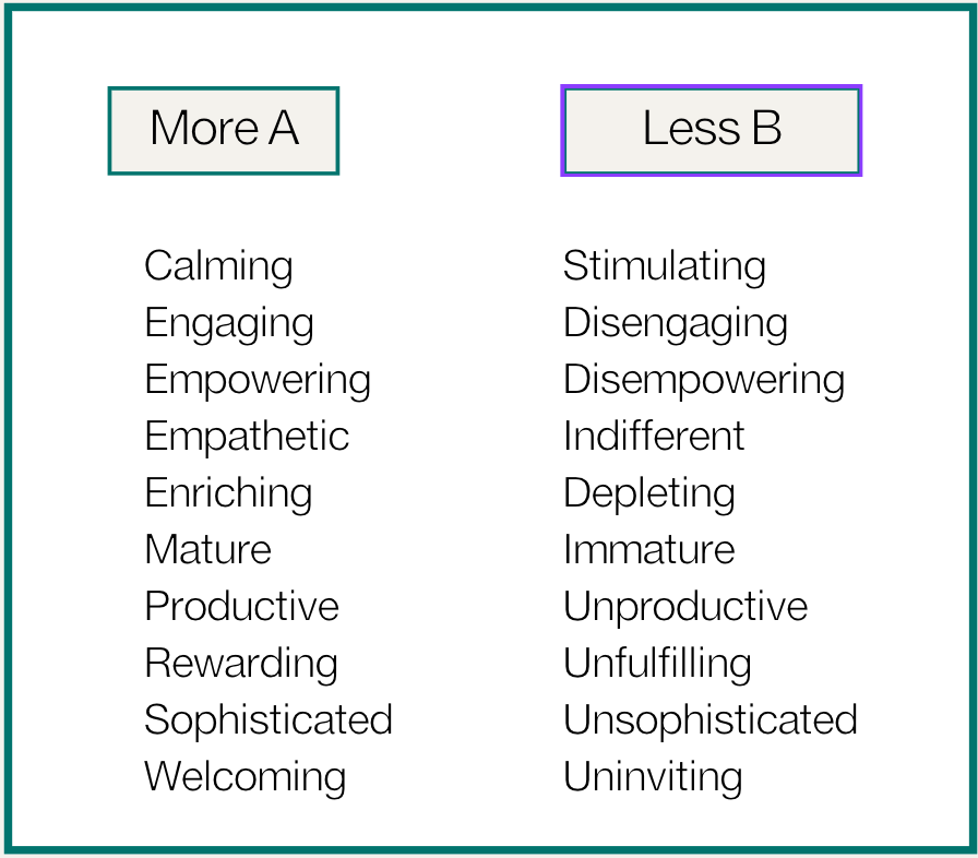
To establish the app's brand identity, I began by brainstorming a list of adjectives that captured the desired user experience.
These carefully chosen adjectives would then be put into a More A than B List and guide the overall brand experience.
UI Library
Key Themes & Insights
*The most anecdotal evidence I discovered was all partnered interviewees conveyed, in some form or another, that despite having/had a partner, they felt that a partner alone couldn't fulfill all their social needs. They expressed a desire for friendships, connections with family, or a sense of belonging in a specific community.
*Kindly note that images are linked for full viewing experience.
At this point, after obtaining both quantitative and qualitative research, prior to choosing a theme to focus on, I realized that my initial How Might We statement needed to be revised as I was trying to address a broad range of issues. I recognized the need to hone in and focus on a specific concern that was consistently mentioned by the participants to create a more targeted and impactful solution.
This revised premise served as the driving force behind my case study challenge.
The Challenge
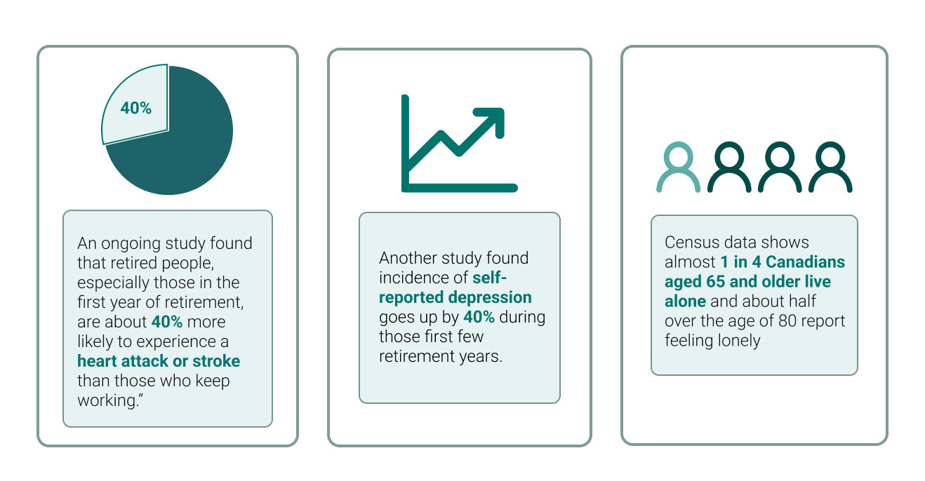
Secondary Research: This phase aimed to gather quantitative data to provide depth to the scope of my research. The quantitative data allowed for the measurement and analysis of various aspects, offering numerical insights to complement qualitative findings obtained through primary research.
Primary Research: I interviewed four retirees using a 14-question survey designed to elicit open-ended responses. This approach aimed to encourage in-depth insights from participants, with the goal of gaining valuable insights and a deeper understanding of the retiree experience. The interviews provided rich qualitative data, allowing me to uncover blind spots that may have been overlooked in my secondary research but also deepened my understanding and empathy for the target audience.
Synthesis of Primary Research Findings
Upon analyzing the affinity map, I synthesized these findings into four overarching themes:
Social Health Concerns
Social Connections
Socially Engaged
Importance of Retiree’s Health
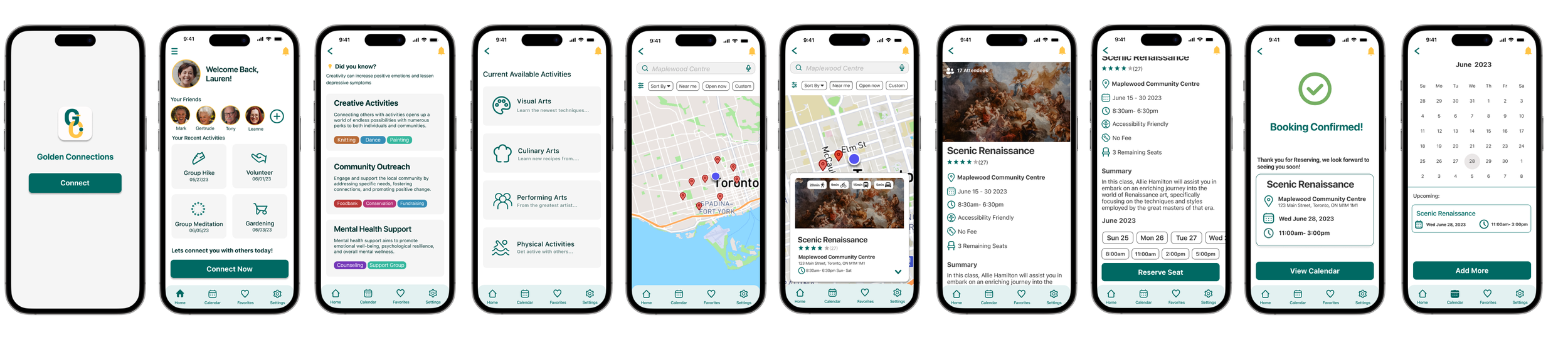
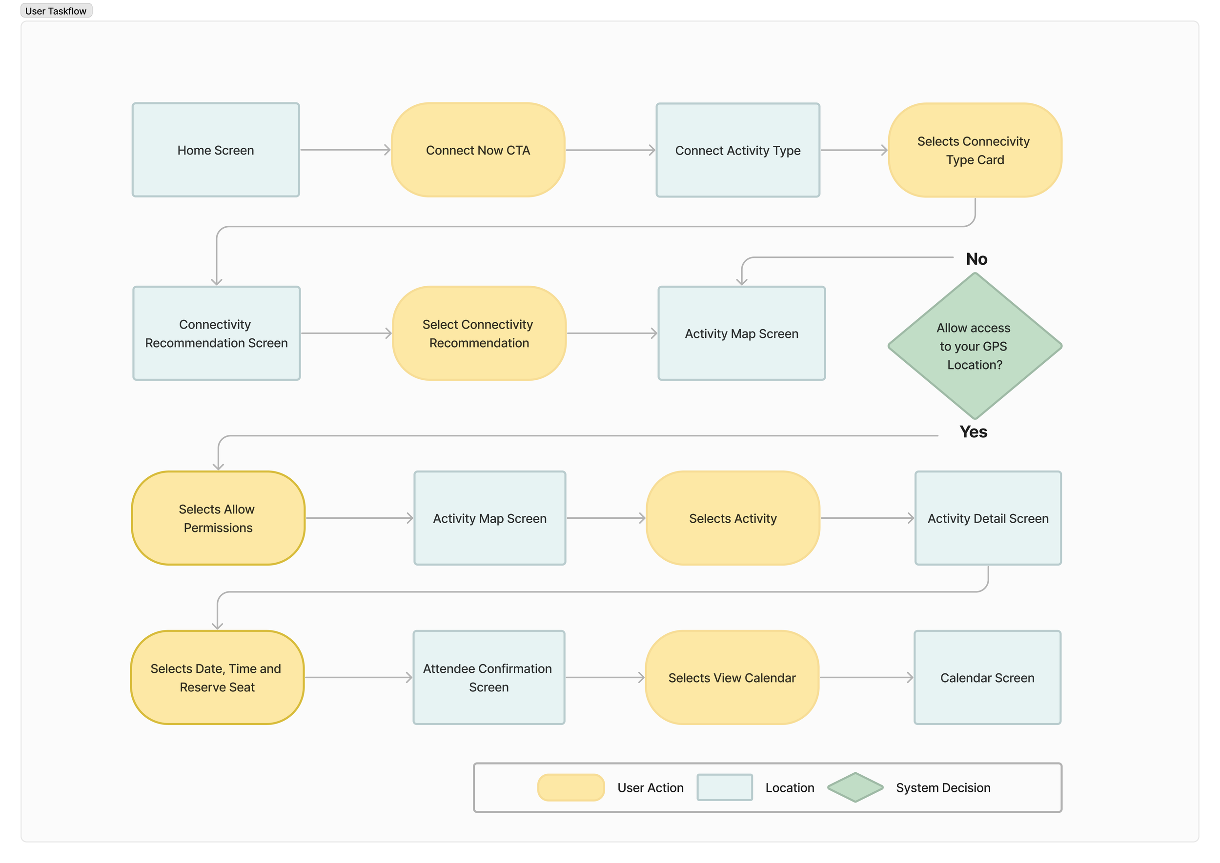
Task flow visualize a linear path for users selecting a group event to attend
*Kindly note that images are linked for full viewing experience.
During my time in retail banking and conversations with clients, I observed a prevalent sense of loneliness among individuals/couples nearing retirement age, particularly those who have become empty nesters and are considering downsizing their homes. This issue hit close to home for me when my own parents approached retirement, prompting me to choose it as the focus of my project case study.
Retirees and their feelings of loneliness is a significant and complex issue that stems from various factors associated with the transition into retirement. Retirement, while marking the end of a professional career, can also bring about substantial changes in an individual's social environment and daily routines.
With my challenge identified I proceeded to answer the following:
How might we assist retirees and their feelings of loneliness?
How might we help retirees improve their social well being by connecting them to social engagements that give them purpose and meaningful connections?
With my revised How Might We statement and insights gathered from my research, I decided to focus on the theme of Social Connections. I believe that this theme provides ample opportunity to design with the user in mind.
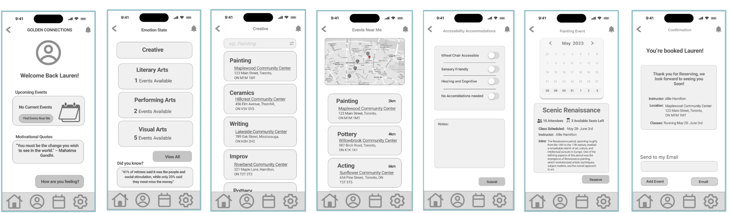
After receiving feedback on Version 2 (V2), I focused on translating my research insights into practical UI design solutions. Additionally accessibility standards, particular to WCAG guidelines, were a top priority. Colors were mindfully chosen to meet a minimum AA+ accessibility tested, for minimal user friction. Icons were streamlined for clarity, and clear micro-interactions were incorporated to enhance the user experience.
To further improve user interaction, I designed the UI with three specific categories in mind, catering to the needs of my target audience.
Simplicity & Consistency:
Keep the design simple and intuitive, to reduce confusion for the user.

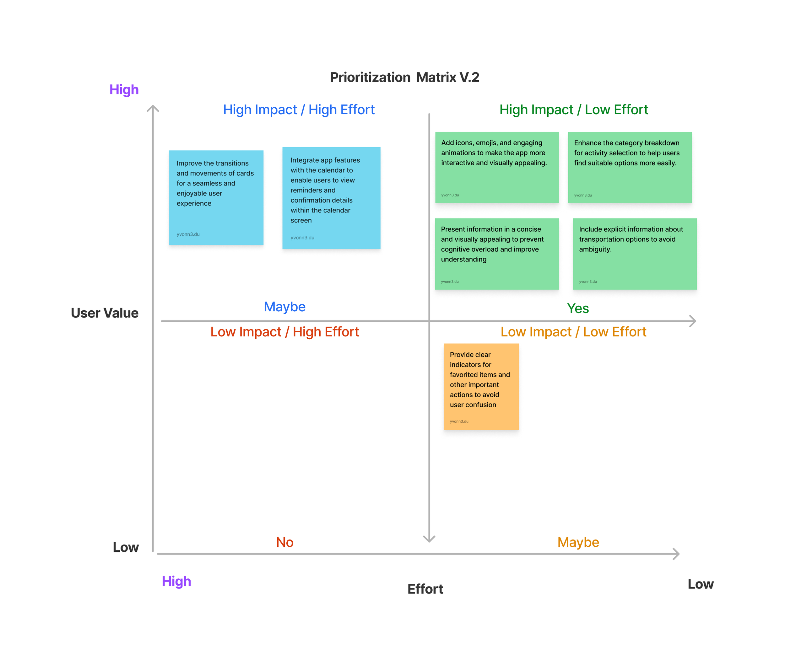
Usability testing data was analyzed and prioritized using a priority matrix. This allowed me to determine the criticality and impact of each issue on the overall user experience addressing the most significant usability concerns and refining the prototype accordingly
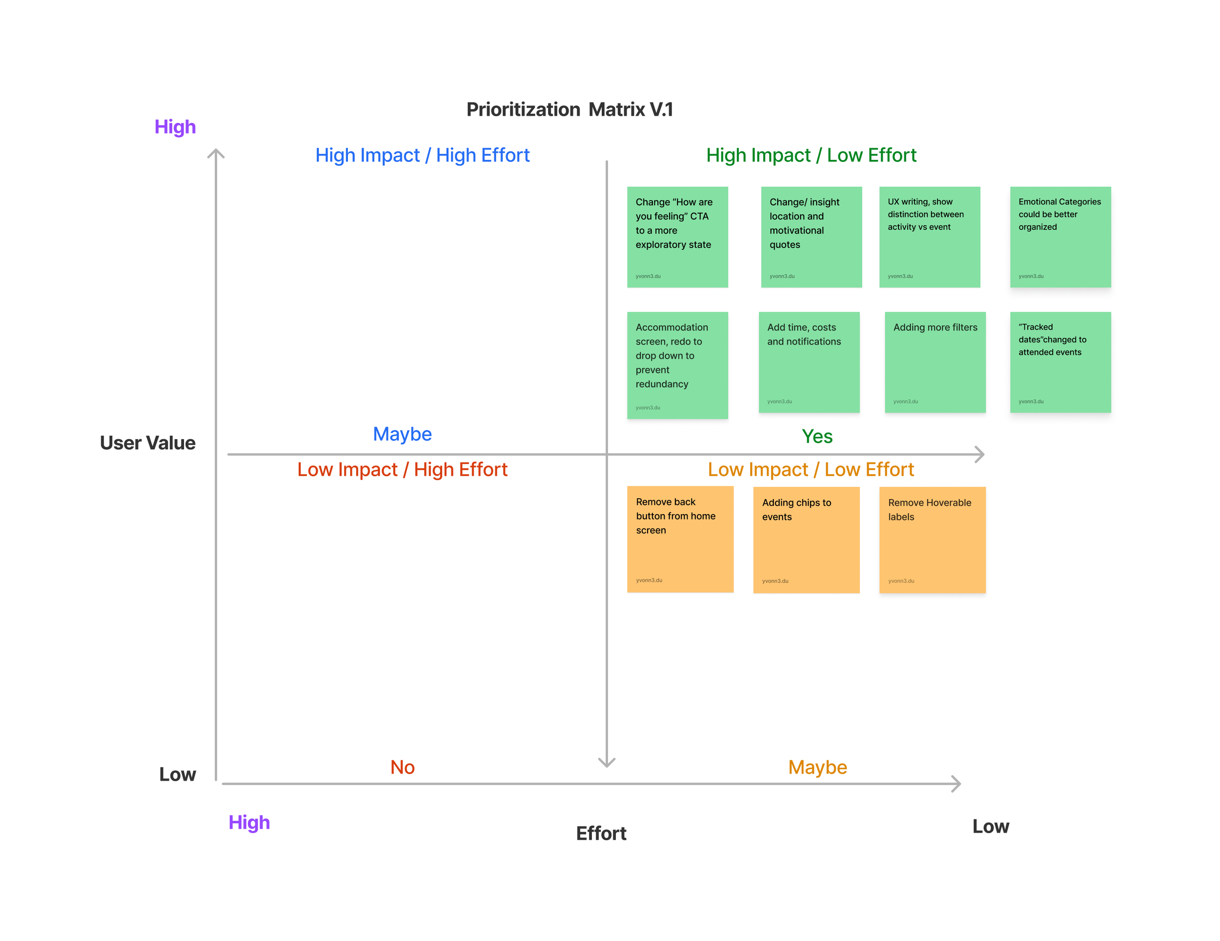
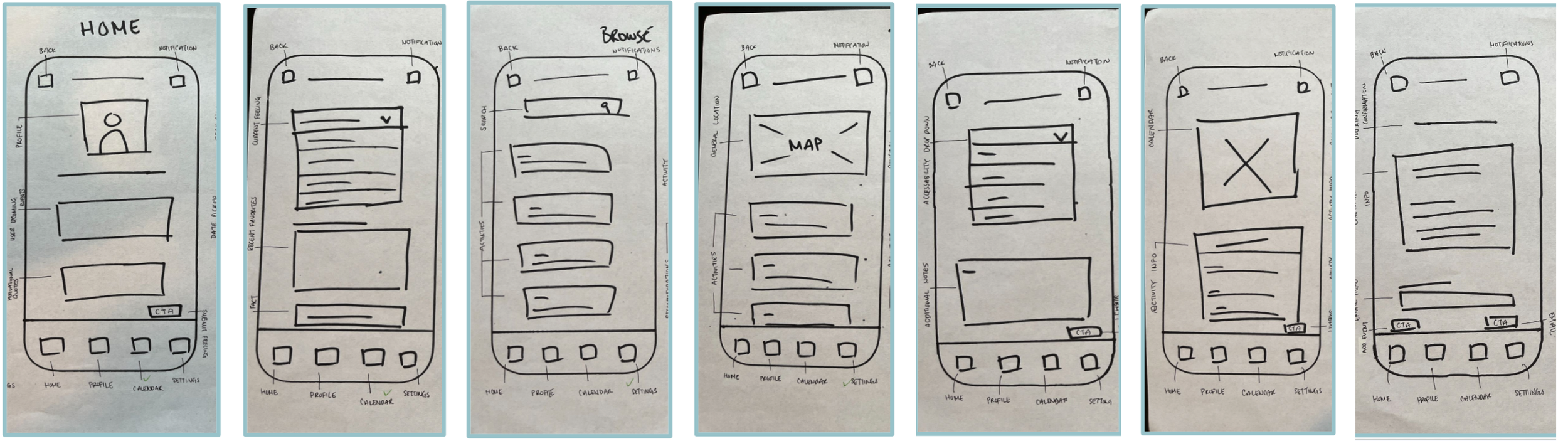
Version 1
Version 2
Design Impact
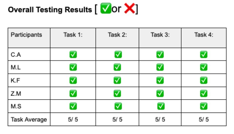
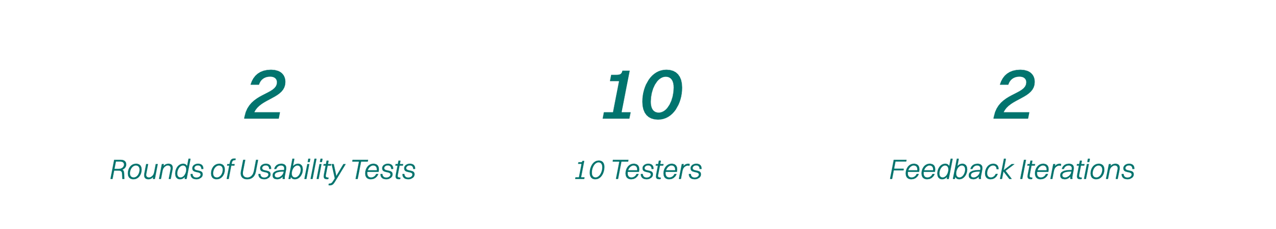
Utilizing comprehensive user research and testing data, we finalized a high-fidelity prototype. We conducted a conclusive usability test with 5 new participants, including individuals with (limited) and without visual impairments.
The results of our last testing phase were impressive, demonstrating a 30% improvement in navigation time and achieving a 80% satisfaction rate.
Users praised the accessibility of the UI components, noting straightforward navigation with little to no confusion.
Sketches & Wireframing
After conceptualizing the task flow, I initiated the design phase for my product. My emphasis was on incorporating essential features and ensuring user-friendly navigation throughout the app.
Following initial prototype testing, I analyzed user feedback to pinpoint usability problems and areas for improvement. Users encountered confusion with the copywriting and information placement, which some found overwhelming. Additionally, the sheer number of options led to decision fatigue.
To tackle these inefficiencies, I prioritized them using a matrix. This ensured I focused on the most impactful issues first, leading to a more successful user experience.
Clear Feedback:
Provide clear feedback for user actions (Micro Interactions) to confirm that their interactions have been registered and understood.
Define
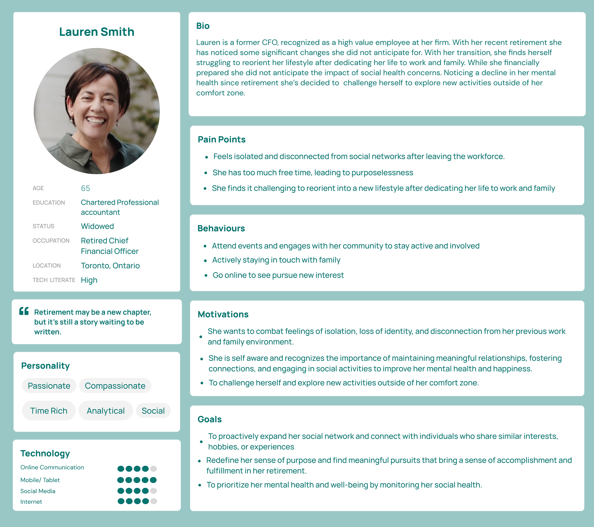
Meet Lauren!
To further empathize with my users, and who I am designing for, I developed a persona that capturing their key characteristics, needs, and preferences. This persona synthesized the pain points, behaviours, and motivations/goals identified through my research and interviews.
By understanding the users' perspective, I could design a solution that directly addresses their specific needs and aspirations.
Initial Testing and Prioritization:
Addressing V1 Feedback and Refining in V2
Branding
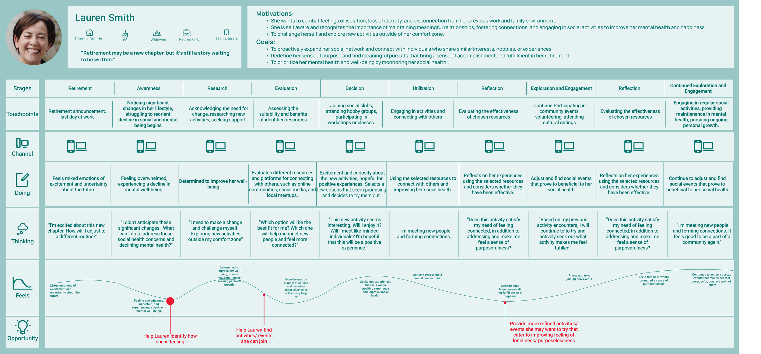
Leveraging the persona's goals, pain points, and behaviors, I created an experience map. This visualization helped me explore the user journey, pinpointing key touchpoints, emotions, and opportunities to improve their interaction with the product.
Ideate
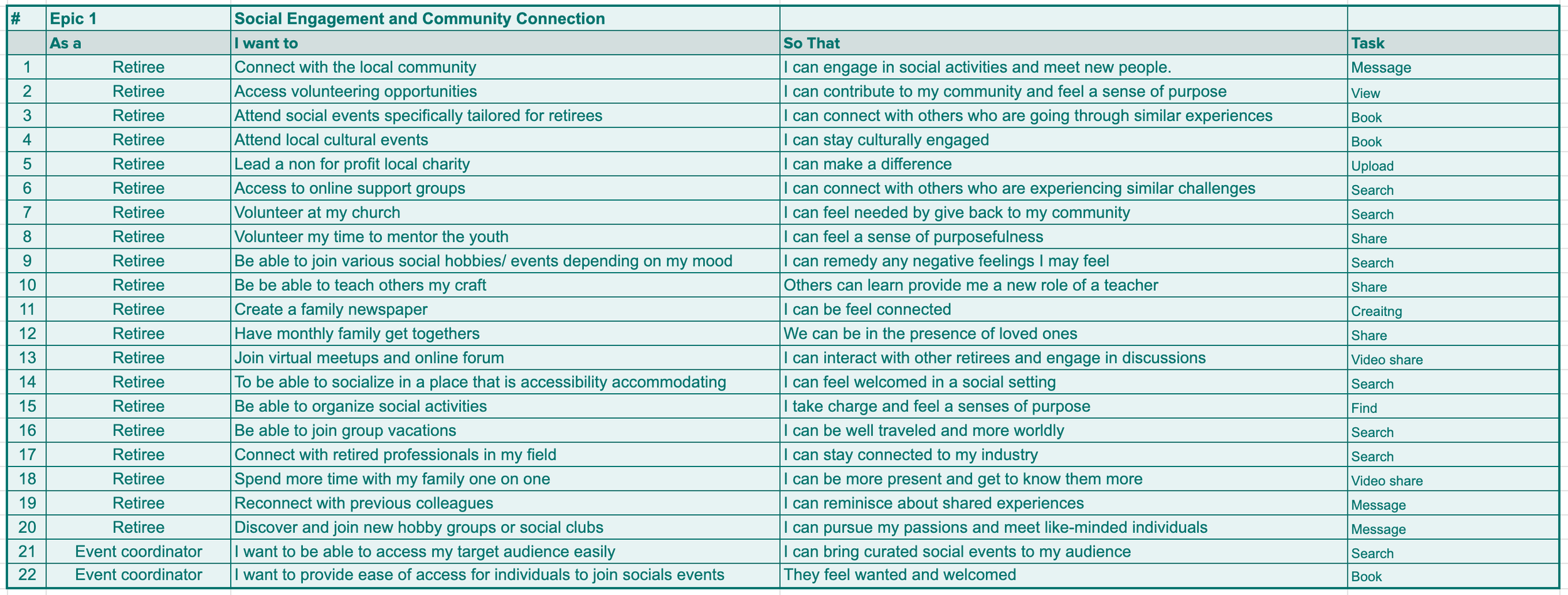
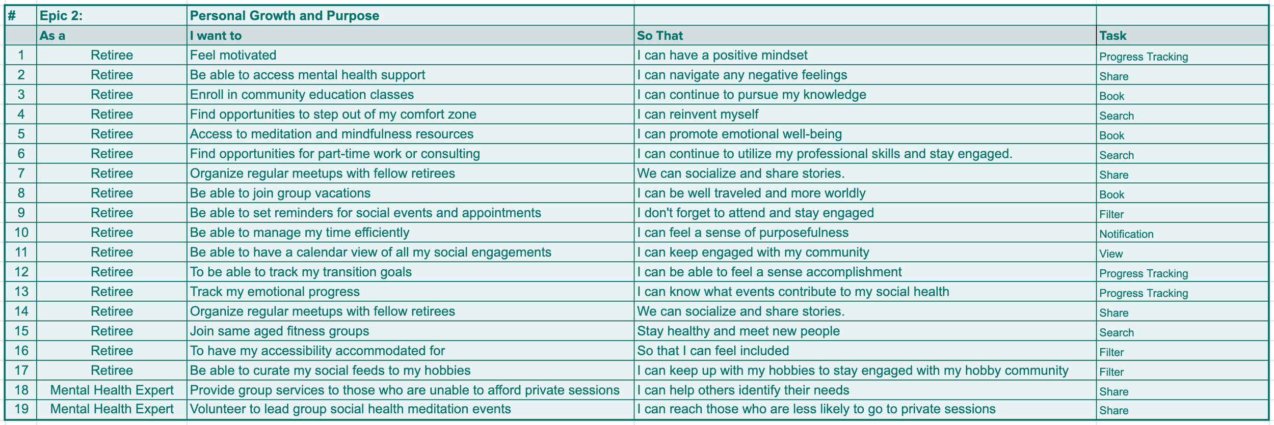
To kick off the user-centric design process, I began by crafting user stories. These stories were then grouped into two overarching epics, which provided a high-level view of the application's functionalities. By outlining user goals and desired actions, the user stories ensured the final application directly addresses user needs and solves potential pain points. This initial phase also laid the groundwork for the information architecture and functionalities that would be housed within the application.
Social Engagement and Community Connection
Personal Growth and Purpose
Main Task Flow
My task flow leverages the epic of Social Engagement and Community Connection. The task flow provided a step-by-step visualization of how users would navigate through the app by exploring activities near by to connect with others. My primary objective was to create a mobile application that allowed users to connect with each other through nearby events and activities. Additionally, the platform would enable online communication to foster new friendships, while prioritizing user privacy, flexibility, and confidence in app-based interactions.
Usability Testing
After addressing usability issues in V1, primarily around preliminary UX copywriting and information hierarchy (as identified by most users), I shifted my focus to new problems identified in V2.
Here, I prioritized issues based on their severity and the time constraints of the project. Notably, V2 feedback highlighted the need for improved visuals and micro-interactions to provide clearer user feedback on actions. This iterative process ensured continuous improvement based on user feedback.
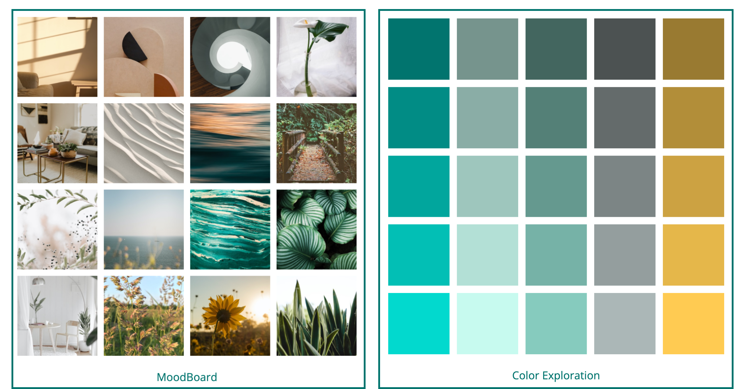
Moodboard & Color Exploration
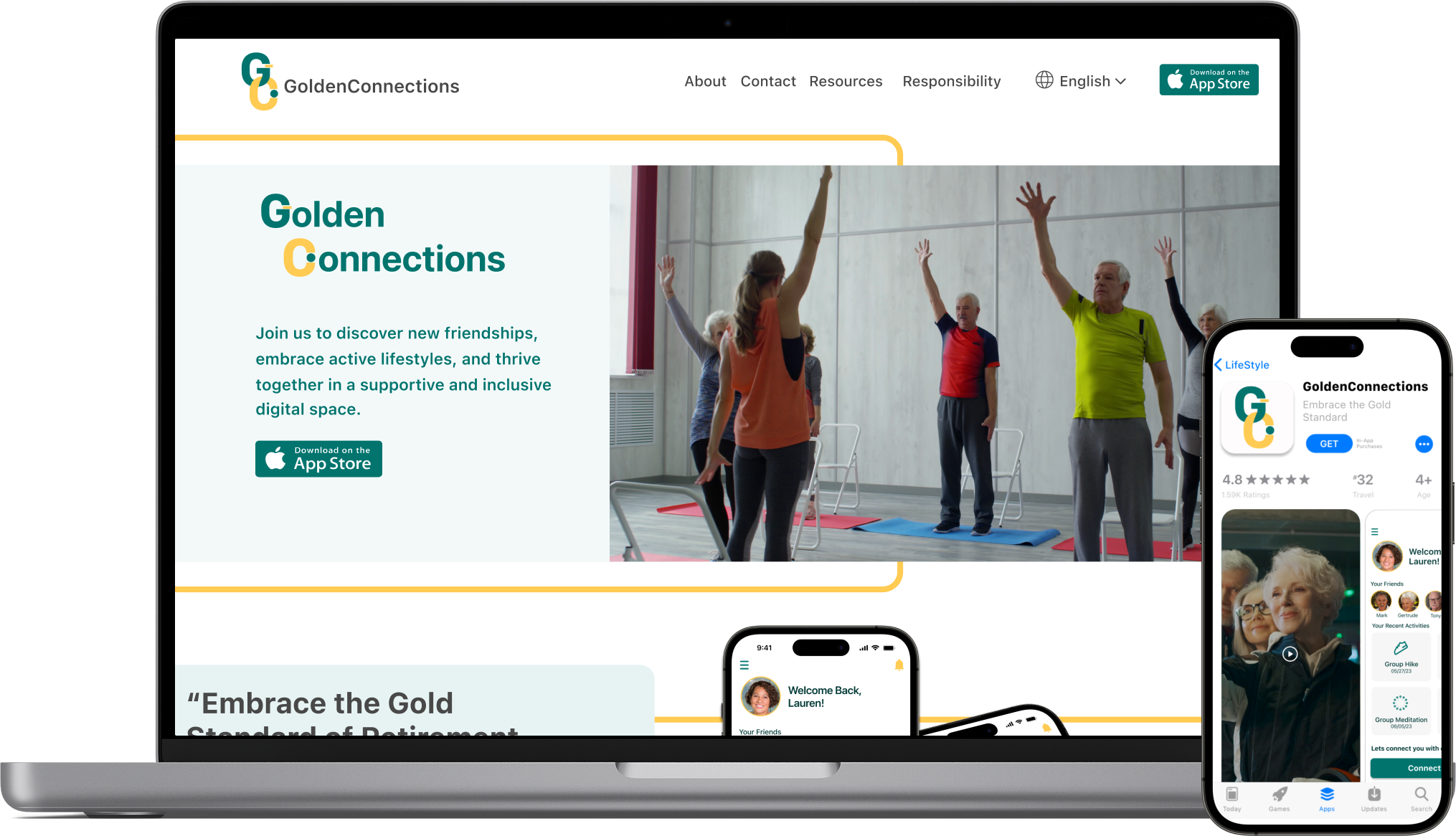
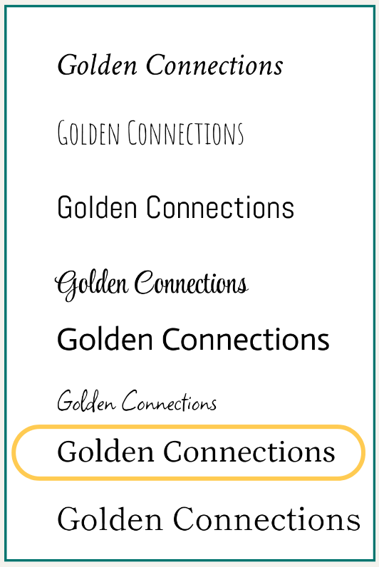
The name "GoldenConnections" holds several meanings. "Golden" symbolizes the stage of life that retirees are in, representing a time of wisdom, experience, and potential. It reflects the idea of embracing the golden years of retirement with positivity and fulfillment. "Connections" emphasizes the app's focus on fostering meaningful social connections among retirees, enabling them to connect, engage, and build relationships with like-minded individuals.
Brand Development
A Moodboard was further created to embody the selected adjective list and brand name, collecting inspiration and curating a colour palette for the desired atmosphere and ambience.
Inspired by the Moodboard, colour selected were of Blue hues, often associated with trust, reliability, and professionalism. This convey a sense of trustworthiness and professionalism, which may be important for retirees who value reliability and credibility.
Blue, along with yellow, can create a visually accessible and age-friendly palette. Contrast and legibility, making it easier to read and interact with especially considering potential visual impairments that may come with age.
Wordmark Exploration

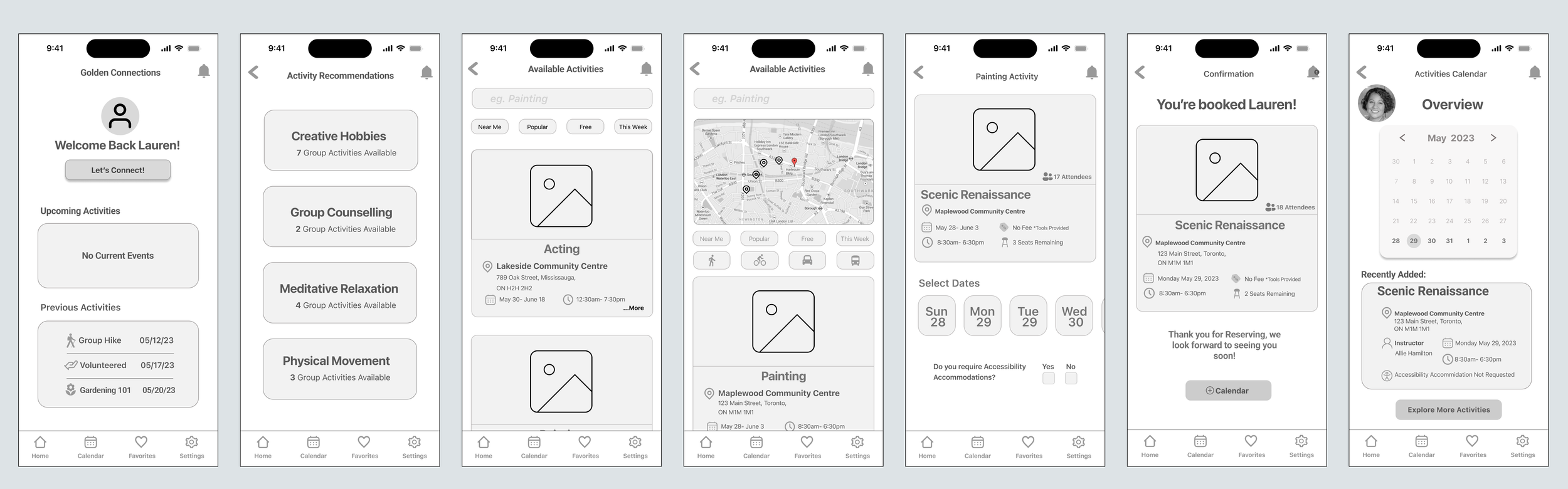
To ensure a consistent look and feel across the user experience, I created a UI library that standardized components throughout the application. These standardized components form the foundation of GoldenConnections, adhering to core UX design principles that prioritize user needs and intuitive interactions.
High Fidelity Prototype